A Gentle Introduction to Exploratory Data Analysis
Includes: pretty drawings, a walkthrough Kaggle example and many a challenge.

Includes: pretty drawings, a walkthrough Kaggle example and many a challenge
Pink singlet, dyed red hair, plated grey beard, no shoes, John Lennon glasses. What a character. Imagine the stories he’d have. He parked his moped and walked into the cafe.
This cafe is a local favourite. But the chairs aren’t very comfortable. So I’ll keep this short (spoiler: by short, I mean short compared to the amount of time you’ll actually spend doing EDA).
When I first started as a Machine Learning Engineer at Max Kelsen, I’d never heard of EDA. There are a bunch of acronyms I’ve never heard of.
I later learned EDA stands for exploratory data analysis.
It’s what you do when you first encounter a data set. But it’s not a once off process.
The past few weeks I’ve been working on a machine learning project. Everything was going well. I had a model trained on a small amount of the data. The results were pretty good.
It was time to step it up and add more data. So I did. Then it broke.
I filled up the memory on the cloud computer I was working on. I tried again. Same issue.
There was a memory leak somewhere. I missed something. What changed?
More data.
Maybe the next sample of data I pulled in had something different to the first. It did. There was an outlier. One sample which had 68 times the amount of purchases as the mean (100).
Back to my code. It wasn’t robust to outliers. It took the outliers value and applied to the rest of the samples and padded them with zeros.
Instead of having 10 million samples with a length of 100, they all had a length of 6800. And most of that data was zeroes.
I changed the code. Reran the model and training began. The memory leak was patched.
Pause.
The guy with the pink singlet came over. He tells me his name is Johnny.
He continues.
‘The girls got up me for not saying hello.’
‘You can’t win,’ I said.
‘Too right,’ he said.
We laughed. The girls here are really nice. The regulars get teased. Johnny is a regular. He told me he has his own farm at home. And his toenails were painted pink and yellow, alternating, pink, yellow, pink, yellow.
Johnny left.
Back to it.
What happened? Why the break in the EDA story?
Apart from introducing you to the legend of Johnny, I wanted to give an example of how you can think the road ahead is clear but really, there’s a detour.
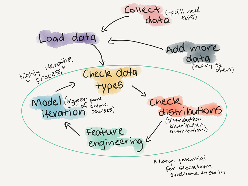
EDA is one big detour. There’s no real structured way to do it. It’s an iterative process.
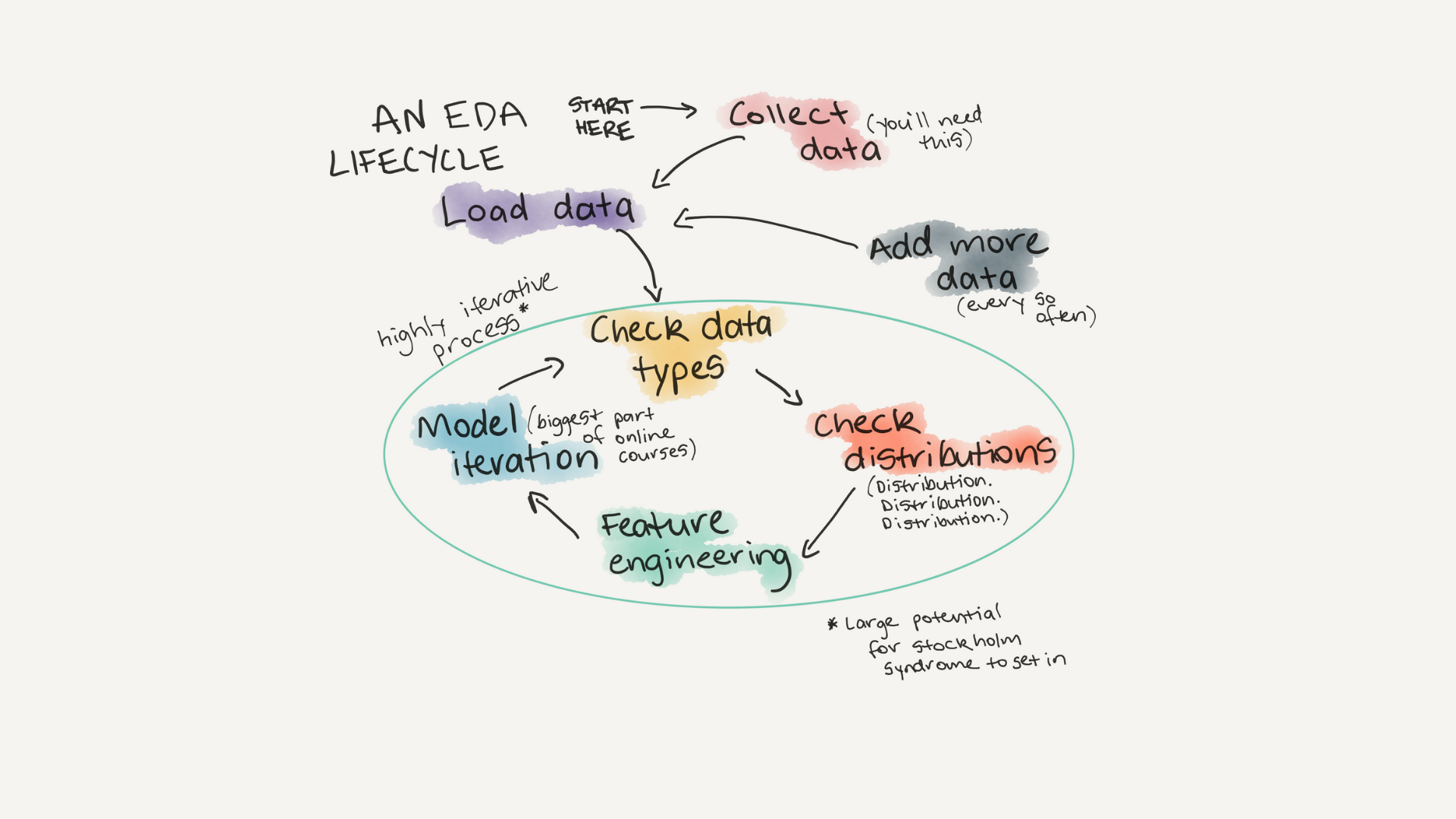
Why do EDA?
When I started learning machine learning and data science, much of it (all of it) was through online courses. I used them to create my own AI Masters Degree. All of them provided excellent curriculum along with excellent datasets.
The datasets were excellent because they were ready to be used with machine learning algorithms right out of the box.
You’d download the data, choose your algorithm, call the .fit() function, pass it the data and all of a sudden the loss value would start going down and you’d be left with an accuracy metric. Magic.
This was how the majority of my learning went. Then I got a job as a machine learning engineer. I thought, finally, I can apply what I’ve been learning to real-world problems.
Roadblock.
The client sent us the data. I looked at it. WTF was this?
Words, time stamps, more words, rows with missing data, columns, lots of columns. Where were the numbers?
‘How do I deal with this data?’ I asked Athon.
‘You’ll have to do some feature engineering and encode the categorical variables,’ he said, ‘I’ll Slack you a link.’
I went to my digital mentor. Google. ‘What is feature engineering?’
Google again. ‘What are categorical variables?’
Athon sent the link. I opened it.
There it was. The next bridge I had to cross. EDA.
You do exploratory data analysis to learn more about the more before you ever run a machine learning model.
You create your own mental model of the data so when you run a machine learning model to make predictions, you’ll be able to recognise whether they’re BS or not.
Rather than answer all your questions about EDA, I designed this post to spark your curiosity. To get you to think about questions you can ask of a dataset.
Where do you start?
How do you explore a mountain range?
Do you walk straight to the top?
How about along the base and try and find the best path?
It depends on what you’re trying to achieve. If you want to get to the top, it’s probably good to start climbing sometime soon. But it’s also probably good to spend some time looking for the best route.
Exploring data is the same. What questions are you trying to solve? Or better, what assumptions are you trying to prove wrong?
You could spend all day debating these. But best to start with something simple, prove it wrong and add complexity as required.
Example time.
Making your first Kaggle submission
You’ve been learning data science and machine learning online. You’ve heard of Kaggle. You’ve read the articles saying how valuable it is to practice your skills on their problems.
Roadblock.
Despite all the good things you’ve heard about Kaggle. You haven’t made a submission yet.
You decide it’s time to enter a competition of your own.
You’re on the Kaggle website. You go to the ‘Start Here’ section. There’s a dataset containing information about passengers on the Titanic. You download it and load up a Jupyter Notebook.
What do you do?
What question are you trying to solve?
‘Can I predict survival rates of passengers on the Titanic, based on data from other passengers?’
This seems like a good guiding light.
An EDA checklist
If a checklist is good enough for pilots to use every flight, it’s good enough for data scientists to use with every dataset.
An EDA checklist
1. What question(s) are you trying to solve (or prove wrong)?
2. What kind of data do you have and how do you treat different types?
3. What’s missing from the data and how do you deal with it?
4. Where are the outliers and why should you care about them?
5. How can you add, change or remove features to get more out of your data?
We’ll go through each of these.Response opportunity: What would you add to the list?
What question(s) are you trying to solve?
I put an (s) in the subtitle. Ignore it. Start with one. Don’t worry, more will come along as you go.
For our Titanic dataset example it’s:
Can we predict survivors on the Titanic based on data from other passengers?
Too many questions will clutter your thought space. Humans aren’t good at computing multiple things at once. We’ll leave that to the machines.

Before we go further, if you’re reading this on a computer, I encourage you to open this Juypter Notebook and try to connect the dots with topics in this post. If you’re reading on a phone, don’t fear, the notebook isn’t going away. I’ve written this article in a way you shouldn’t need the notebook but if you’re like me, you learn best seeing things in practice.
What kind of data do you have and how to treat different types?
You’ve imported the Titanic training dataset.
Let’s check it out.training.head()
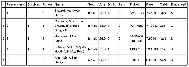
Column by column, there’s: numbers, numbers, numbers, words, words, numbers, numbers, numbers, letters and numbers, numbers, letters and numbers and NaNs, letters. Similar to Johnny’s toenails.
Let’s separate the features (columns) out into three boxes, numerical, categorical and not sure.

In the numerical bucket we have, PassengerId, Survived, Pclass, Age, SibSp, Parch and Fare.
The categorical bucket contains Sex and Embarked.
And in not sure we have Name, Ticket and Cabin.
Now we’ve broken the columns down into separate buckets, let’s examine each one.
The Numerical Bucket

Remember our question?
‘Can we predict survivors on the Titanic based on data from other passengers?’
From this, can you figure out which column we’re trying to predict?
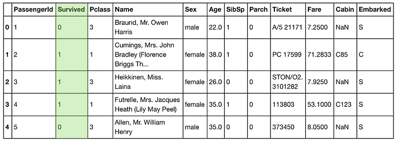
The Survived column. And because it’s the column we’re trying to predict, we’ll take it out of the numerical bucket and leave it for the time being.
What’s left?
PassengerId,Pclass, Age, SibSp, Parch and Fare.
Think for a second. If you were trying to predict whether someone survived on the Titanic, do you think their unique PassengerId would really help with your cause?
Probably not. So we’ll leave this column to the side for now too. EDA doesn’t always have to be done with code, you can use your model of the world to begin with and use code to see if it’s right later.
How about Pclass, SibSp and Parch?
These are numbers but there’s something different about them. Can you pick it up?
What does Pclass, SibSp and Parch even mean? Maybe we should’ve read the docs more before trying to build a model so quickly.
Google. ‘Kaggle Titanic Dataset’.
Found it.
Pclass is the ticket class, 1 = 1st class, 2 = 2nd class and 3 = 3rd class. SibSp is the number of siblings a passenger has on board. And Parch is the number of parents someone had on board.
This information was pretty easy to find. But what if you had a dataset you’d never seen before. What if a real estate agent wanted help predicting house prices in their city. You check out their data and find a bunch of columns which you don’t understand.
You email the client.
‘What does Tnummean?’
They respond. ‘Tnum is the number of toilets in a property.’
Good to know.
When you’re dealing with a new dataset, you won’t always have information available about it as Kaggle provides. This is where you’ll want to seek the knowledge of an SME.
Another acronym. Great.
SME stands for subject matter expert. If you’re working on a project dealing with real estate data, part of your EDA might involve talking with and asking questions of a real estate agent. Not only could this save you time, but it could also influence future questions you ask of the data.
Since no one from the Titanic is alive anymore (RIP (rest in peace) Millvina Dean, the last survivor), we’ll have to become our own SMEs.
There’s something else unique about Pclass, SibSp and Parch. Even though they’re all numbers, they’re also categories.
How so?
Think about it like this. If you can group data together in your head fairly easily, there’s a chance it’s part of a category.
The Pclasscolumn could be labelled, First, Second and Third and it would maintain the same meaning as 1, 2 and 3.
Remember how machine learning algorithms love numbers? Since Pclass, SibSp and Parch are already all in numerical form, we’ll leave them how they are. The same goes for Age.
Phew. That wasn’t too hard.
The Categorical Bucket

In our categorical bucket, we have Sex and Embarked.
These are categorical variables because you can separate passengers who were female from those who were male. Or those who embarked on C from those who embarked from S.
To train a machine learning model, we’ll need a way of converting these to numbers.
How would you do it?
Remember Pclass? 1st = 1, 2nd = 2, 3rd = 3.
How would you do this for Sex and Embarked?
Perhaps you could do something similar for Sex. Female = 1 and male = 2.
As for Embarked, S = 1 and C = 2.
We can change these using the .LabelEncoder() function from the sklearn library.
training.embarked.apply(LabelEncoder().fit_transform)

We’ve made some good progress towards turning our categorical data into all numbers but what about the rest of the columns?Challenge: Now you know Pclass could easily be a categorical variable, how would you turn Age into a categorical variable?
The Not Sure Bucket

Name, Ticket and Cabin are left.
If you were on The Titanic, do you think your name would’ve influenced your chance of survival?
It’s unlikely. But what other information could you extract from someone's name?
What if you gave each person a number depending on whether their title was Mr., Mrs. or Miss.?
You could create another column called Title. In this column, those with Mr. = 1, Mrs. = 2 and Miss. = 3.
What you’ve done is created a new feature out of an existing feature. This is called feature engineering.
Converting titles to numbers is a relatively simple feature to create. And depending on the data you have, feature engineering can get as extravagant as you like.
How does this new feature affect the model down the line? This will be something you’ll have to investigate.
For now, we won’t worry about the Name column to make a prediction.
What about Ticket?
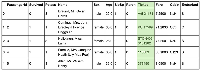
The first few examples don’t look very consistent at all. What else is there?
training.Ticket.head(15)

These aren’t very consistent either. But think again. Do you think the ticket number would provide much insight as to whether someone survived?
Maybe if the ticket number related to what class the person was riding in, it would have an effect but we already have that information in Pclass.
To save time, we’ll forget the Ticket column for now.
Your first pass of EDA on a dataset should have the goal of not only raising more questions about the data but to get a model built using the least amount of information possible so you’ve got have a baseline to work from.
Now, what do we do with Cabin?
You know, since I’ve already seen the data, my spidey-senses are telling me it’s a perfect example for the next section.
Challenge: I’ve only listed a couple examples of numerical and categorical data here. Are there any other types of data? How do they differ to these?
What’s missing from the data and how do you deal with it?
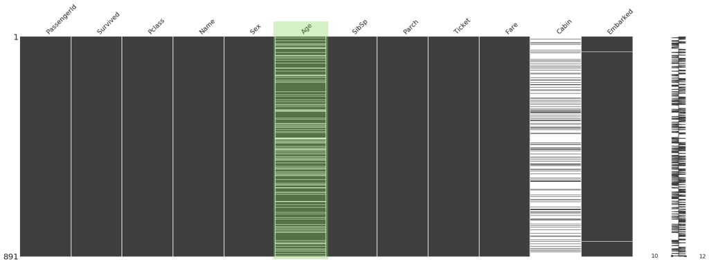
missingno.matrix(train, figsize = (30,10))
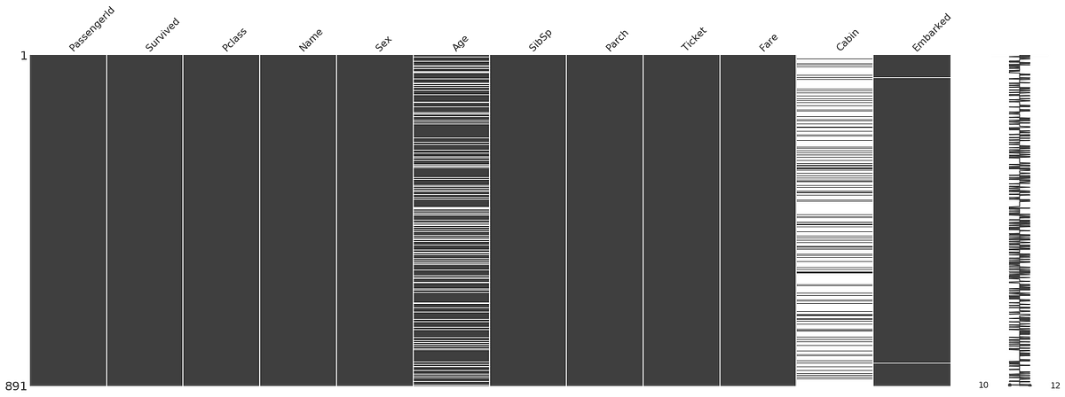
The Cabin column looks like Johnny’s shoes. Not there. There are a fair few missing values in Age too.
How do you predict something when there’s no data?
I don’t know either.
So what are our options when dealing with missing data?
The quickest and easiest way would be to remove every row with missing values. Or remove the Cabin and Age column entirely.
But there’s a problem here. Machine learning models like more data. Removing large amounts of data will likely decrease the ability of our model to predict whether a passenger survived or not.
What’s next?
Imputing values. In other words, filling up the missing data with values calculated from other data.
How would you do this for the Age column?
Could you fill missing values with average age?
There are drawbacks to this kind of value filling. Imagine you had 1000 total rows, 500 of which are missing values. You decide to fill the 500 missing rows with the average age of 36.
What happens?
Your data becomes heavily stacked with the age of 36. How would that influence predictions on people 36-years-old? Or any other age?
Maybe for every person with a missing age value, you could find other similar people in the dataset and use their age. But this is time-consuming and also has drawbacks.
There are far more advanced methods for filling missing data out of scope for this post. It should be noted, there is no perfect way to fill missing values.
If the missing values in the Age column is a leaky drain pipe the Cabin column is a cracked dam. Beyond saving. For your first model, Cabin is a feature you’d leave out.
Challenge: The Embarked column has a couple of missing values. How would you deal with these? Is the amount low enough to remove them?
Where are the outliers and why you should be paying attention to them?
‘Did you check the distribution?’ Athon asked.
‘I did with the first set of data but not the second set…’
It hit me.
There it was. The rest of the data was being shaped to match the outlier.
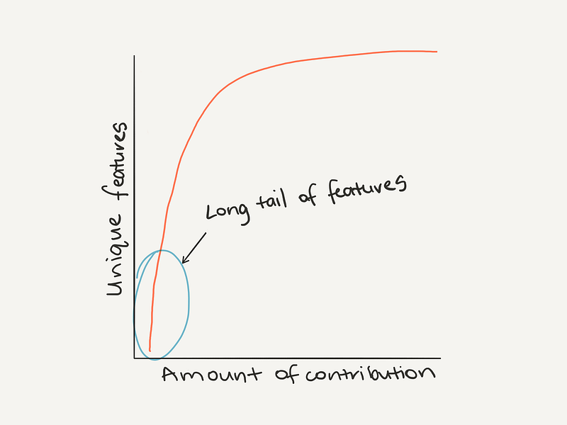
If you look at the number of occurrences of unique values within a dataset, one of the most common patterns you’ll find is Zipf’s law. It looks like this.
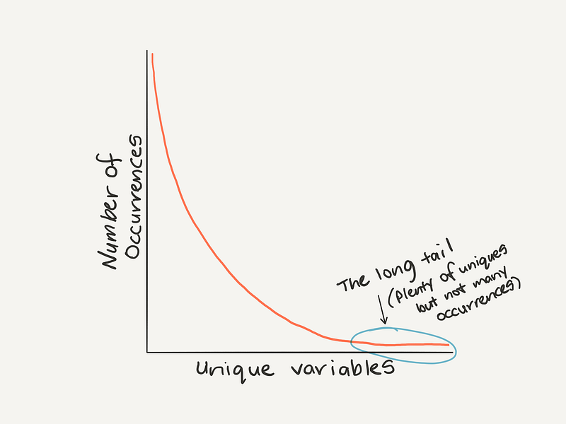
Remembering Zipf’s law can help to think about outliers (values towards the end of the tail which don’t occur often are potential outliers).
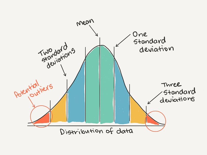
The definition of an outlier will be different for every dataset. As a general rule of thumb, you may consider anything more than 3 standard deviations away from the mean might be considered an outlier.
Or from another perspective.
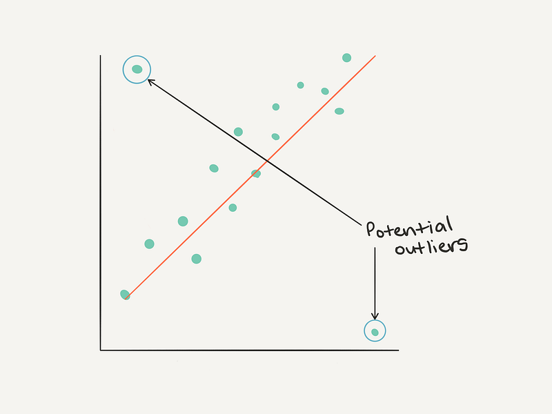
How do you find outliers?
Distribution. Distribution. Distribution. Distribution. Four times is enough (I’m trying to remind myself here).
During your first pass of EDA, you should be checking what the distribution of each of your features is.
A distribution plot will help represent the spread of different values of data you have across. And more importantly, help to identify potential outliers.
train.Age.plot.hist()
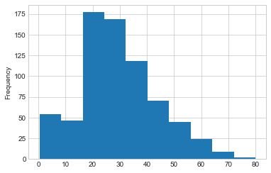
Why should you care about outliers?
Keeping outliers in your dataset may turn out in your model overfitting (being too accurate). Removing all the outliers may result in your model being too generalised (it doesn’t do well on anything out of the ordinary). As always, best to experiment iteratively to find the best way to deal with outliers.Challenge: Other than figuring out outliers with the general rule of thumb above, are there any other ways you could identify outliers? If you’re confused about a certain data point, is there someone you could talk to? Hint: the acronym contains the letters M E S.
Getting more out of your data with feature engineering
The Titanic dataset only has 10 features. But what if your dataset has hundreds? Or thousands? Or more? This isn’t uncommon.
During your exploratory data analysis process, once you’ve started to form an understanding AND you’ve got an idea of the distributions AND you’ve found some outliers AND you’ve dealt with them, the next biggest chunk of your time will be spent on feature engineering.
Feature engineering can be broken down into three categories: adding, removing and changing.
The Titanic dataset started out in pretty good shape. So far, we’ve only had to change a few features to be numerical in nature.
However, data in the wild is different.
Say you’re working on a problem trying to predict the changes in banana stock requirements of a large supermarket chain across the year.
Your dataset contains a historical record of stock levels and previous purchase orders. You're able to model these well but you find there are a few times throughout the year where stock levels change irrationally. Through your research, you find during a yearly country-wide celebration, banana week, the stock levels of bananas plummet. This makes sense. To keep up with the festivities, people buy more bananas.
To compensate for banana week and help the model learn when it occurs, you might add a column to your data set with banana week or not banana week.# We know Week 2 is a banana week so we can set it using np.where()
df["Banana Week"] = np.where(df["Week Number"] == 2, 1, 0)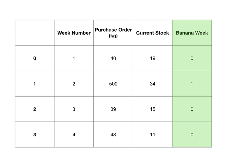
Adding a feature like this might not be so simple. You could find adding the feature does nothing at all since the information you’ve added is already hidden within the data. As in, the purchase orders for the past few years during banana week are already higher than other weeks.
What about removing features?
We’ve done this as well with the Titanic dataset. We dropped the Cabin column because it was missing so many values before we even ran a model.
But what about if you’ve already run a model using the features left over?
This is where feature contribution comes in. Feature contribution is a way of figuring out how much each feature influences the model.
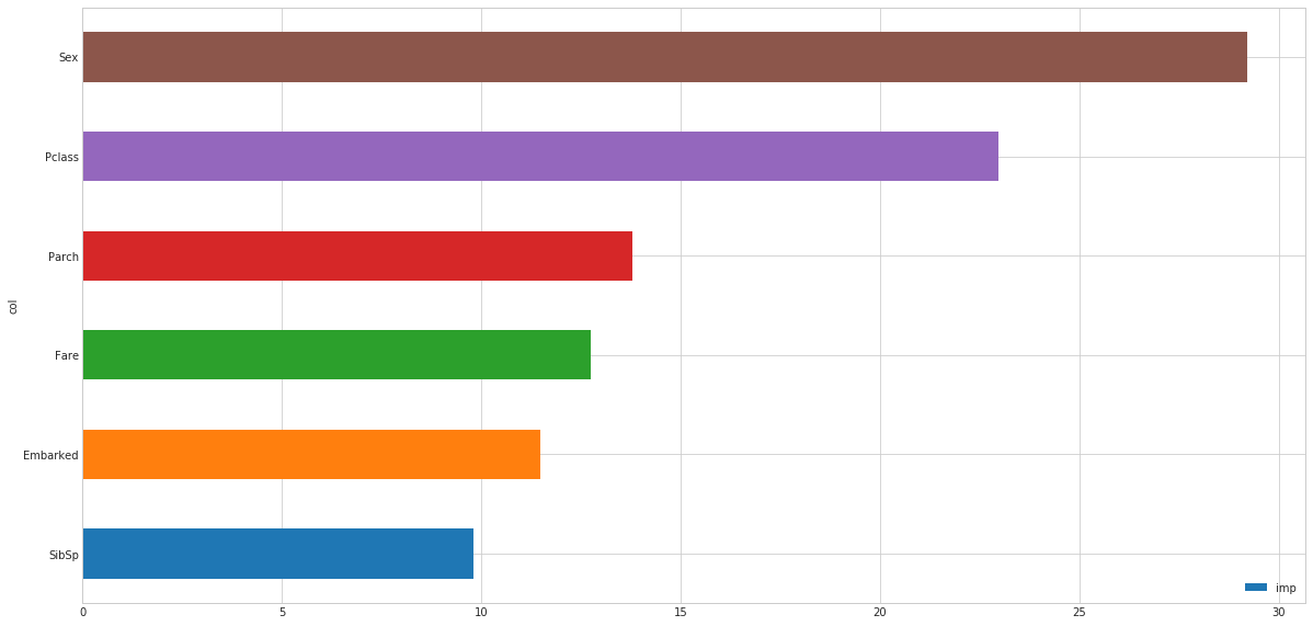
Why is this information helpful?
Knowing how much a feature contributes to a model can give you direction as to where to go next with your feature engineering.
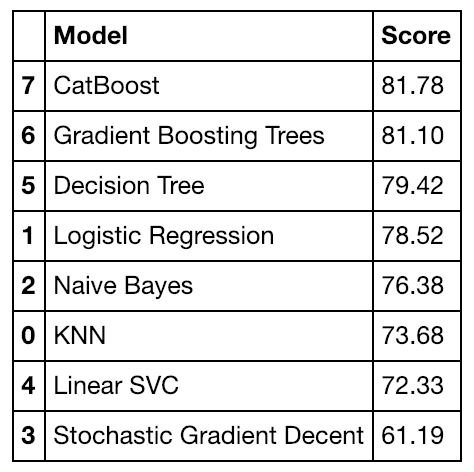
In our Titanic example, we can see the contribution of Sex and Pclass were the highest. Why do think this is?
What if you had more than 10 features? How about 100? You could do the same thing. Make a graph showing the feature contributions of 100 different features.
‘Oh, I’ve seen this before!’
Zipf’s law back at it again. The top features have far more to contribute than the bottom features.
Seeing this, you might decide to cut the lesser contributing features and improve the ones contributing more.
Why would you do this?
Removing features reduces the dimensionality of your data. It means your model has fewer connections to make to figure out the best way of fitting the data.
You might find removing features means your model can get the same (or better) results on fewer data and in less time.
Like Johnny is a regular at the cafe I’m at, feature engineering is a regular part of every data science project.Challenge: What are other methods of feature engineering? Can you combine two features? What are the benefits of this?
Building your first model(s)
Finally. We’ve been through a bunch of steps to get our data ready to run some models.
If you’re like me, when you started learning data science, this is the part you learned first. All the stuff above had already been done by someone else. All you had to was fit a model on it.
Our Titanic dataset is small. So we can afford to run a multitude of models on it to figure out which is the best to use.
Notice how I put an (s) in the subtitle, you can pay attention to this one.
Running multiple models is fine on our small Titanic dataset. But might not be the best for larger datasets.
Once you’ve had some practice with different datasets, you’ll start to figure out what kind of model usually works best. For example, most recent Kaggle competitions have been won with ensembles (combinations) of different gradient boosted tree algorithms.
Once you’ve built a few models and figured out which is best, you can start to optimise the best one through hyperparameter tuning. Think of hyperparameter tuning as adjusting the dials on your oven when cooking your favourite dish. Out of the box, the preset setting on the oven works pretty well but out of experience you’ve found lowering the temperature and increasing the fan speed brings tastier results.
It’s the same with machine learning algorithms. Many of them work great out of the box. But with a little tweaking of their parameters, they work even better.
But no matter what, even the best machine learning algorithm won’t result in a great model without adequate data preparation.
EDA and model building is a repeating circle.
A final challenge (and some extra-curriculum)
I left the cafe. My ass was sore.
At the start of this article, I said I’d keep it short. You know how that turned out. It will be the same as your EDA iterations. When you think you’re done. There’s more.
We covered a non-exhaustive EDA checklist with the Titanic Kaggle dataset as an example.
1. What question are you trying to solve (or prove wrong)?
Start with the simplest hypothesis possible. Add complexity as needed.
2. What kind of data do you have?
Is your data numerical, categorical or something else? How do you deal with each kind?
3. What’s missing from the data and how do you deal with?
Why is the data missing? Missing data can be a sign in itself. You’ll never be able to replace it with anything as good as the original but you can try.
4. Where are the outliers and why should pay attention to them?
Distribution. Distribution. Distribution. Three times is enough for the summary. Where are the outliers in your data? Do you need them or are they damaging your model?
5. How can you add, change or remove features to get more out of your data?
The default rule of thumb is more data = good. And following this works well quite often. But is there anything you can remove get the same results? Start simple. Less but better.
There are examples of everything we’ve discussed here (and more) in the notebook on GitHub and a video of me going through the notebook step by step on YouTube (the coding starts at 5:05).
FINAL BOSS CHALLENGE: If you’ve never entered a Kaggle competition before, and want to practice EDA, now’s your chance. Take the notebook I’ve created, rewrite it from top to bottom and improve on my result.
Extra-curriculum bonus: Daniel Formoso's notebook is one of the best resources you’ll find for an extensive look at EDA on a Census Income Dataset. After you’ve completed the Titanic EDA, this is a great next step to check out.
If you’ve got something on your mind you think this article is missing, leave a response below or send me a note.